One of the best known charts is a simple bar chart containing frequencies or percentages. The easiest way to run it in SPSS is the FREQUENCIES command. This tutorial walks you through some options. We’ll use freelancers.sav throughout, part of which is shown below.

Option 1: FREQUENCIES
In most cases, a simple FREQUENCIES command is our best option because it takes multiple variables in one go. Its syntax -shown below- is so simple that just typing it is probably faster than messing around with the menu.
frequencies sector_2010 to sector_2014
/format notable
/barchart.
Result – Basic
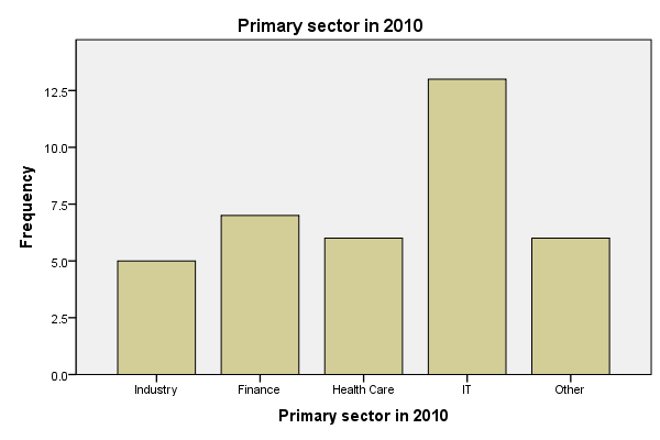
Unsurprisingly, we created the desired bar charts but -like most SPSS charts- they look awful. A great way to fix that is using an SPSS chart template. Just one template is sufficient for having pretty bar charts for once and for all.
A chart template can also transpose (“put on its side”) our chart, which works much better for bar charts than SPSS’ default orientation. One of the charts that resulted from the template we built is shown below.
Result – Chart Template
Sorting Categories and Percentages
A nice -albeit little known- option is sorting the categories. If we transpose our chart, we can sort our bars by descending frequency by specifying /FORMAT NOTABLE AFREQ (use DFREQ for untransposed charts).
Second, we can have percentages instead of frequencies by using /BARCHART PERCENT as shown in the syntax below.
Sorted Bar Charts with Percentages Syntax
frequencies sector_2010
/format notable afreq
/barchart percent.
Result
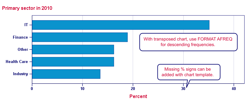
Note: the %-sign is missing from our chart but we can fix this by modifying our chart template.
Option 2: GRAPH
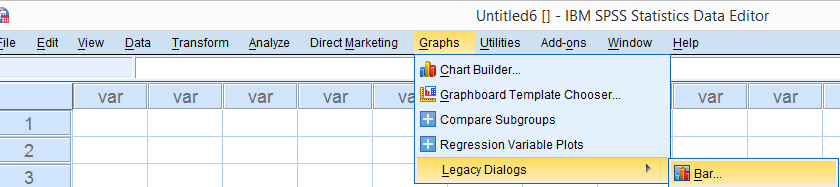
When we run bar charts with FREQUENCIES, the variable labels of the variables involved are used as chart titles. If we want custom titles instead, we’re perhaps better off by using GRAPH. Since its syntax is a bit more difficult, we’ll generate it from the menu as shown below.
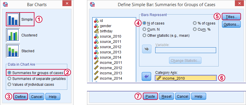
Resulting Syntax
GRAPH
/BAR(SIMPLE)=PCT BY sector_2010
/TITLE=’All Respondents | n = 40′.
Note: unfortunately, GRAPH takes only one variable at the time. However, we can remove the line breaks from the syntax and copy-paste-edit it a couple of times for a handful of variables. For running charts or tables over many variables, see SPSS with Python – Looping over Scatterplots.
Second, GRAPH does not allow us to sort our categories but a chart template can fix that.
SPSS Bar Charts – Chart Sizes
One issue with all SPSS charts is that their sizes are fixed in pixels. However, a bar chart for many categories needs more space than a chart for few categories. In fact, categories may disappear altogether if they don’t fit into the chart anymore. SPSS does not offer a solution for this other than “stretching” each chart manually in the output viewer. For a better solution, see SPSS – Set Chart Sizes Tool.
With respect to the layout of reports, we prefer having the heights (rather than the widths) of our charts depend on the amount of content they contain. This is yet another good reason for always transposing our bar charts.
Conclusion
In most cases, typing a simple FREQUENCIES command is by far the best option for creating bar charts. GRAPH as pasted from  is a reasonable option too.
As with most charts, is better avoided since it’s way more complicated and results in the exact same chart as the aforementioned options.
Bar Charts – FREQUENCIES Versus GRAPH
The table below quickly summarizes the differences between the two options we discussed in this tutorial.
| FEATURE | FREQUENCIES | GRAPH |
|---|---|---|
| Multiple variables | Yes | No |
| Category sorting | Yes | Only with chart template |
| Percent sign | Only with chart template | Yes |
| Custom title | No | Yes |