You may know about RGB and CMYK, but how about LAB or HSB? With all these color choices and ways to use them it’s often easy to get confused. In this introduction to Illustrators color tools you will learn about the different color spaces, how they work and what tools you can use to get the most out of them. Let’s get familiar with the powerful color tools that Illustrator offers!
About Digital Colors
Colors are everywhere around us and every time we deal with them in digital or print media they are represented by several color models. These color models are based on the way the colors tones are mixed.
RGB
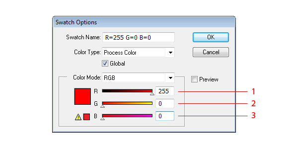
This color model is created by overlaying Red (1), Green (2) and Blue (3) colored lights. It represents a wide range of color shades. Every of these three colors has range from 0 to 255 which represents their intensity. For example R=0 G=0 B=0 represents Black and R=255 G=255 B=255 represents White.
CMYK
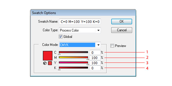
This color model is based on absorbing ink printed on paper. It’s working with Cyan (1), Magenta (2), Yellow (3) and Key/Black (4) the particular color is mixed through percentual values of these colors. Lower percentage equals the lighter colors and higher percentage equals darker colors. For Example C=0% M=0% Y=0% K=0% represents White and C=100% M=100% Y=100% K=100% represents Black.
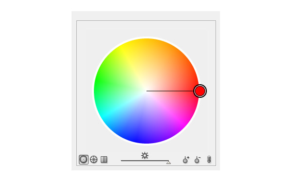
HSB
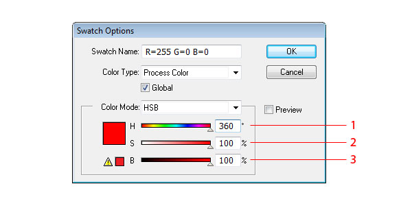
This color model is closest to human perception of colors. HSB contains three base elements which are Hue (1) Saturation (2) and Brightness (3). This color model can be also found as HSV which means Hue Saturation and Value and is similar to HSB. Hue (1) is the position of color on the color wheel. It’s value is defined in degrees. If you want to see the Color Wheel in action look at kuler.adobe.com. Saturation indicates the amount of gray in the shade of particular color in percents – 0% equals Grey and 100% equals deep color.
Brightness (3) or Value indicates the brightness or murkiness of the color – 0% equals black and 100% equals full color.
LAB
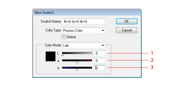
This color model is based on how color looks rather than its value on digital media. It represents the absolute value of color independently from computers. The color value is mixed through three axes. L (1) which means lightness and has value from 0/Black to 100/White, a (2) which represents green to red axes and b (3) which represents blue to yellow axes.
Selecting Color
You can use various way to select the exact color you want to use in your artwork.
Eyedropper tool (I)
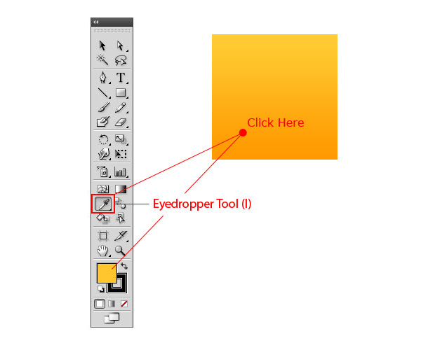
Take the exact color from part of the artwork when you click on it. Just select the Eyedropper Tool (I) and click on the artwork at the point where you want to get the color from. If you have selected shape in the artwork it gets the color from the eyedropper too.
Color Panel
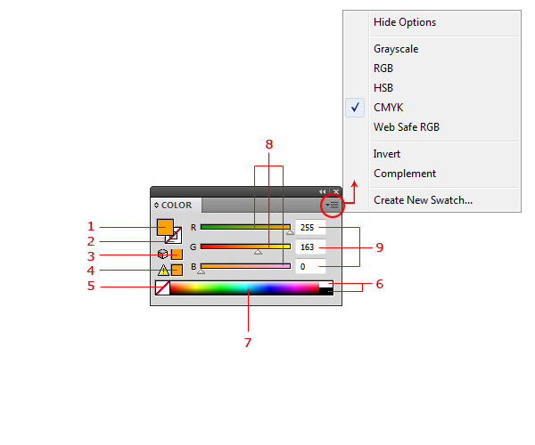
This is Illustrator’s color mixing and editing pool. You can mix the color here, change the color mode (through context menu I mentioned earlier) or check if the color is safe for print. On the left there is the current fill color (1), current stroke color (2), out of web color warning (3) – this means that you are not using web safe color. If you want to use web one click on the icon and it will change it to the nearest web color; Out of gamut (4) – which means that you are using the non-printable color. To fix an out of gamut color, click on the icon as in the case of web color to fix it; the transparent/no color (5) – click on it if you want to use no color for fill or stroke; Black/White color (6) and color pane (7) – just click in it to select the color you want. Color value sliders (8) – using the color sliders you can craft your swatch to exact tone you want, you can also use the number values instead of sliders (9).
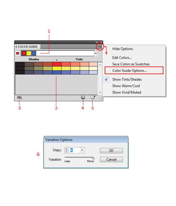
Color Guide Panel
Color panel can be described as the built-in inspiration tool for art work. It’s a simple color mixing tool like Kuler with capabilities to create a particular color and its shades and variations. You can choose ready made variations through the dropdown menu (1). You can also choose color from the shades palette (2) which updates every time you pick the color somewhere in illustrator. If you want to use a particular group of colors you can limit the guide to use one of the swatch libraries (3). Just to create brand new set of color directly from Color Guide panel click on Edit Color button (4) to get the color wheel. Two other things you can do in the Color Guide panel are creating new swatch libraries by saving the color guide selection (5) use Variation Options if you want to use a particular number of colors (6).
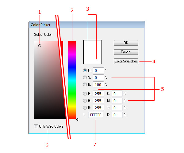
Color Picker dialog box
Color Picker can be accessed by double-clicking the fill or stroke color on Toolbar. This tool is the same through most of Adobe applications and it contains Color Field (1) to pick the shade, the Color Spectrum bar (2) to pick the color; area showing the current and new color (3) for comparison; Color Modes options (5); Switch to Web Colors checkbox (6); and HEX value of selected color (7). There is also the button for accessing Color Swatches (4) which is similar to Photoshop.
Swatches Panel
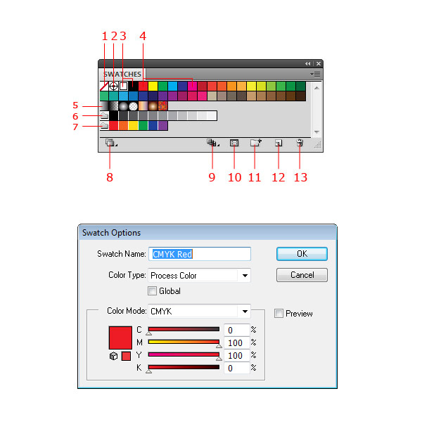
The swatches panel does what you are expecting it to do, providing the swatches and the swatch libraries. By using this panel you can quickly pick a swatch or create your own set of swatches. The Illustrator standard swatch panel contains transparent/no color (1), registration color (2) which means that this color will be printed on all plates during the printing process, then colors continues with black and white (3), CMYK group of colors (4), several other colors to work with and gradient/pattern fills (5). Below these swatches you can see two simple swatch libraries – shades of grey (6) and brights (7). If you want to add some other color libraries as shades of grey or brights ones then you can find them through swatch libraries menu (8). The Show Swatch Kinds Menu (9) is useful when you want to use only particular type of swatch library – colors/gradients. Swatch Options (10) were already explained. Other possibilities in the Swatches panel are Creating New Color Group (11) from current artwork or from selected swatches; creating New Swatch (12) or Deleting (13) the existing one. The context menu of the Swatches panel offers explained points and sorting functions for swatches.
Gradients
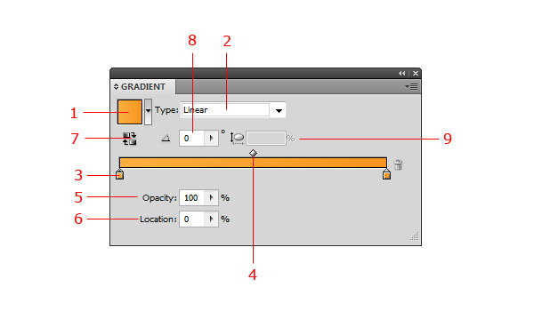
The Gradient panel provides several tools to develop a gradient you want to use in the artwork. The Gradient Fill dropdown (1) provides preset gradient types and also saves your gradients as well. If you want to add new gradient just click dropdown – save button. The gradients can be linear or radial, these options can be set in the Gradient Type dropdown (2). For the gradient it’s necessary to set at least two colors (3). You can adjust the center point between two color points by Gradient Slider (4). As the center point the position of color points can be set by dragging them or manually through the Location (6). You can set also the opacity of the color points (5) and the angle/direction of the gradient (8). The last two options are to Switch the direction of gradient (7) and adjust the dimensions of it (9).
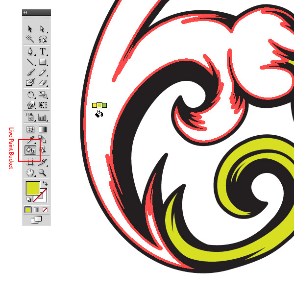
Live Paint Bucket Tool
Live Paint Bucket (K) is great tool to color a shape in the dynamic way. It’s biggest power is in coloring sketches after tracing. Using this tool is as simple as working with paint bucket in Photoshop. You only have to select a group of shapes and the color you want to use. When the mouse is over, the fillable area appears with red borders so you know which one will be filled.
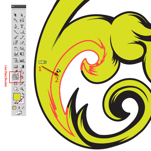
Live Paint Bucket Tool Eyedropper option
If you want to use color from the artwork and not from swatches you can use the eyedropper option. Select Live Paint Bucket Tool (K), set it over the color of the artwork you want to use and press Command, pick the color and release Command (1). Now you can use the color from the artwork somewhere else (2).
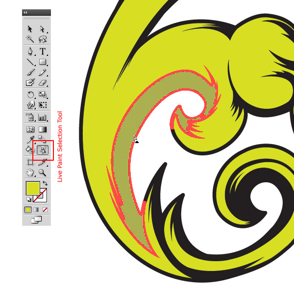
Live Paint Selection Tool
This tool picks and highlights shapes or meshes. You can pick several shapes or meshes with Shift + Mouse click.
Paint Bucket and Live Paint Selection Tools settings
The settings can be accessed by double clicking on tools in the tool panel, there are several options to set up. You can set the tool to select or paint fills and strokes, showing of the swatch over cursor and color of the highlight. In Live Paint Selection Tool settings it is also possible to set the width of the highlight area.
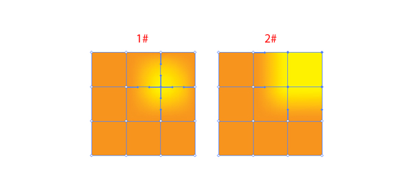
Gradient Mesh Tool
Mesh tool is powerful and is my favorite illustrator ‘weapon’. It’s simple and with some practice it’s possible to do anything one can imagine from simple gradients to complex, shiny, photorealistic images. Basically, Gradient Mesh can be created from any vector object in your artwork except compound objects or text.
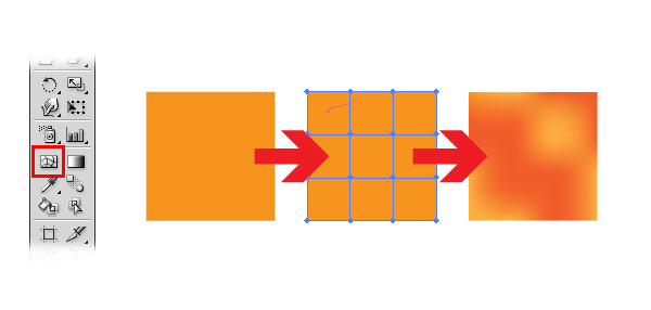
Create & Edit Gradient Mesh
Ways to create Gradient Mesh:
- Select the Mesh Tool (U) and click into the object you want to change to Gradient Mesh. This adds the mesh points into object.
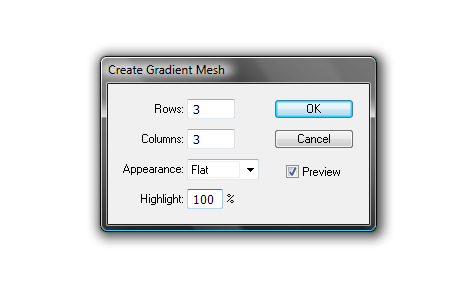
- Select the object you want to change to Gradient Mesh and choose Object > Create Gradient Mesh Tool. This way creates regular set of mesh points in the object. You can set number of horizontal and vertical mesh points and type of appearance of highlight.
- Select object filled with a gradient, select Object > Expand and select Gradient Mesh.
Ways to edit Gradient Mesh:
- To add new mesh point select Mesh Tool (U) and click into object.
- To delete mesh point Command-click on mesh point with Mesh Tool (U) selected.
- To move mesh point drag it with Mesh Tool (U) or with Direct Selection Tool (A). To keep the mesh point on the mesh line shift-drag it.
- To change color of the gradient mesh drag the color from swatches panel or by Eyedropper tool (I) on the mesh point (1) or mesh patch (2).