Line charts are used to display trends over time. Use a line chart if you have text labels, dates or a few numeric labels on the horizontal axis. Use a scatter chart (XY chart) to show scientific XY data.
To create a line chart, execute the following steps.
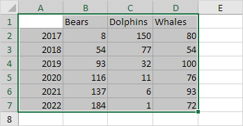
1. Select the range A1:D7.
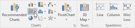
2. On the Insert tab, in the Charts group, click the Line symbol.
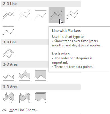
3. Click Line with Markers.
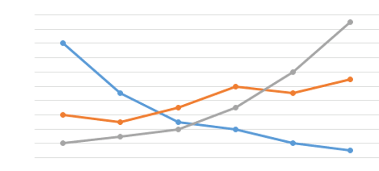
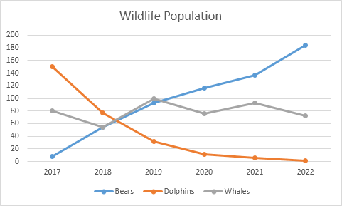
Result:
Note: only if you have numeric labels, empty cell A1 before you create the line chart. By doing this, Excel does not recognize the numbers in column A as a data series and automatically places these numbers on the horizontal (category) axis. After creating the chart, you can enter the text Year into cell A1 if you like..