


SPSS Output Introduction
In SPSS, we usually work from 3 windows. These are
- the data editor window

- the syntax editor window

- the output viewer window


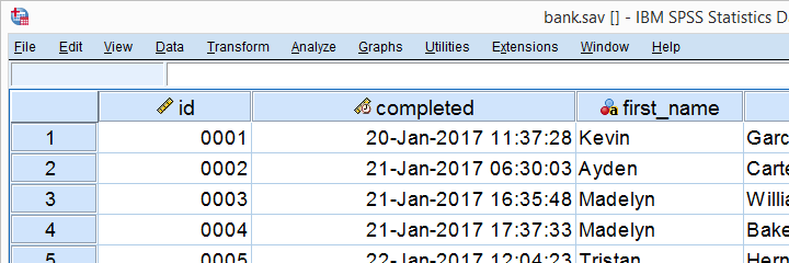
Our previous tutorials discussed the data editor and the syntax editor windows. So let’s now take a look at the output viewer. We suggest you follow along by downloading and opening bank.sav, part of which is shown below.

SPSS Output – First Steps
Right. So with out data open, let’s create some output by running the syntax below.
frequencies educ marit jtype
/barchart
/order variable.
Running this syntax opens an output viewer window as shown below.


As illustrated, the SPSS output viewer window always has 2 main panes:
- the output outline is mostly used for navigating through your output items and
- the actual output items -mostly tables and charts- are often exported to WORD or Excel for reporting.
In the output outline, you can also delete output items -SPSS often produces way more output than you ask for. Use the ctrl key to select multiple items. A faster way for deleting a selection of output items is OUTPUT MODIFY.
You can also collapse and reorder output items in the outline but I don’t find that too useful. So let’s turn to the actual output items. The most important ones are tables and charts so we’ll discuss those separately.
SPSS Output – Tables
We’ll usually want to make some adjustments to our output tables. One option for doing so is right-clicking the table and selecting 


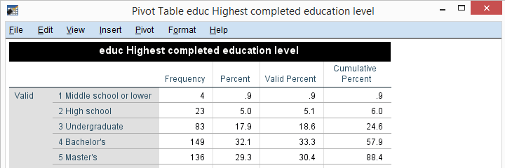
The pivot table editor window (shown below) allows us to adjust basically anything about our table.
That being said, we recommend youyou only use the pivot table editor if everything else fails.One reason is that you can’t replicate and rerun whatever you do in the pivot table editor. And more importantly, there are faster options with which you can adjust many tables in one go. So let’s explore some of those.
Variable and Value Labels in Output Tables
When I’m inspecting my data, I want to see variable names and labels in my output. The same goes for values and value labels because I want to know how my variables have been coded.
However, I want to see only labels in the final tables that I’ll report. One way for doing so is navigating to


Oddly, the options dialog has no button. This is because it creates very messy syntax. A much better option for this than the crappy menu is just running the syntax below.
set
tnumbers labels
tvars labels.
- TVARS is short for ”table variables”. It sets how variables are shown in tables: names, labels or both;
- TNUMBERS is short for “table numbers”. It sets how values are shown in tables: values, labels or both.
Running this syntax is a much better option than using the aforementioned menu. After doing so, all output tables we’ll run will show only variable and value labels.
SPSS Table Templates
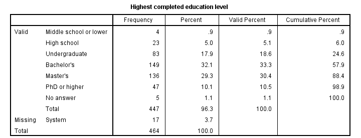
Another thing I don’t like about these tables is their styling: grey fonts with grey backgrounds. The best way to fix this is setting a table template before running any tables. Running set tlook ‘C:\Program Files\IBM\SPSS\Statistics\24\Looks\Original.stt’.does the trick for me. On your computer, you may need a slightly different path. If I now rerun my frequency distributions, they’ll look much nicer as shown below.

Right. So those are the main basics regarding output tables. Let’s now turn to our charts.
SPSS Output – Charts
First off, you can adjust basically anything about charts in the chart editor window. You can open one by right clicking a chart as shown below.

This opens a chart editor window as shown below.
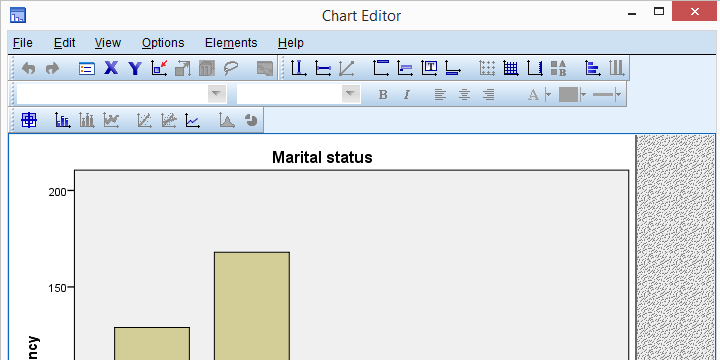

As a rule of thumb,only use the chart editor if everything else fails.There’s better ways to adjust charts than using the chart editor window. So let’s explore some of those.
SPSS Chart Templates
You can apply styling -colors, borders, sizes and so on- to charts by setting a chart template before running any charts. The proper way to do so is running something likeSET CTEMPLATE ‘C:\Program Files\IBM\SPSS\Statistics\24\Looks\sometemplate.sgt’.After doing so, all of our bar charts look as shown below. If you have some nice chart templates, it’s a matter of seconds to have all of your charts look great.

SPSS – All Output to WORD
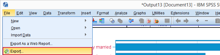
A great way to convert SPSS output to WORD is exporting all contents of the output viewer in one go. You can do so by navigating to
Selecting the options below results in a WORD document containing all tables and charts shown in your output viewer. This is the ideal starting point for writing your report.


Since you can batch edit tables and charts in SPSS -but not in WORD- make sure your output is as good as it gets before converting it. A great way to adjust tables and delete unwanted output items is OUTPUT MODIFY.
Copy-Pasting SPSS Output Tables to WORD
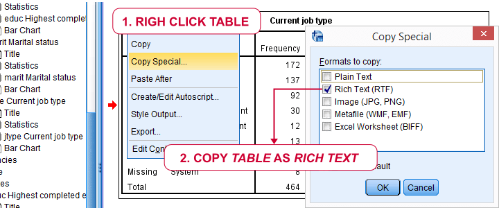
If you need only a handful of output items in WORD, you can also just copy-paste them. The ctrl + c and ctrl + v shortkeys usually work fine for both tables and charts. If it fails, however, use copy special for tables as shown below.
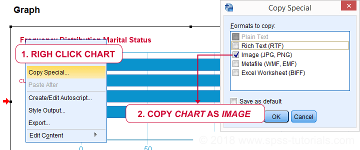
The same goes for copy-pasting charts to WORD: first try ctrl + c. If that doesn’t work, copy the chart as an image as shown below.
SPSS – All Output to Excel
You can convert all contents of your output window -including all tables and charts- in one go to a single Excel sheet. For doing so, navigate to

Copy-Pasting SPSS Output Tables to Excel
If you need just a couple of output tables in Excel, you can copy-paste them with the ctrl + c and ctrl + v shortkeys. If that fails, use copy special as Excel worksheet as shown below.

SPSS Output Tricks
SPSS users tend to waste a lot of time and effort on manually adjusting output items. The easiest way for doing so -like discussed- is using the pivot table editor and chart editor windows. We also suggested to use these only if everything else fails. So which are better -and especially faster– alternatives?
- Try to style tables with table templates. These can apply fonts, borders, colors, text-alignment and more to one or many tables. To some extent, table templates can also hide table elements such as titles and captions.
- For styling charts, use chart templates. These can also hide chart elements such as titles and labels.
- You can convert one or many output tables to a single SPSS dataset by using the OMS. You can further process this dataset in SPSS and/or save it as Excel or some other format. OMS is easy to use from the menu. It can also suppress a selection of output items: warnings, case processing summaries and so on.
- You can apply numeric formats -and hence set decimal places– to a selection of table columns, rows or cells with OUTPUT MODIFY. It can also apply conditional formatting -such as boldface or italicize- table cells or delete a selection of output items.
- You can edit almost anything for one or many output items with Python scripting. This is harder to use and works slower than OUTPUT MODIFY. However, it accomplishes much more. For an example, see SPSS Correlations in APA Format.
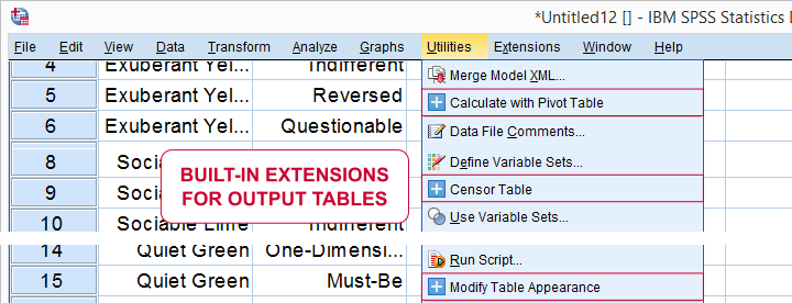
- Several table adjustments can be made from extensions that are built into recent SPSS versions with the SPSS Python Essentials installed. Most are based on Python scripting and are found under as shown below.
SPSS Output – Final Notes
Right, so that’ll do for introducing SPSS output. I hope we clarified some basics. Some of the output tricks may be suitable only for experienced or even expert SPSS users. However, I thought you should at least be aware that they exist.